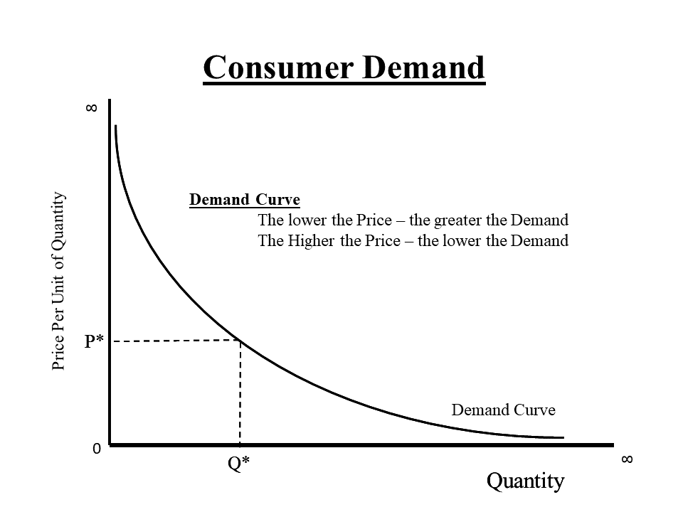
This diagram represents a Simple Common Sense understanding of Consumer Demand
For any product or service at all –
- The amount that is demanded by consumers will vary according to the price charged.
- The lower the price of a good or service, the more is demanded.
- The higher the price of a good or service, the less is demanded.
Think of the PRICE as the cost to the consumer of the quantity desired.
- And that cost is not just the Dollars and Cents you have to fork over.
- It also includes your time and frustration in obtaining the good or service.
Think about a Tim Horton’s coffee –
- The cheaper the cup of coffee, the more cups of coffee the store will sell.
- Sometimes, the cheaper the cup of coffee, the more “add ons” you will buy – a Decaf Caramel Mocha Macchiato!
- Part of your costs, as a consumer, is the time and cost of getting to the store, and the frustration of waiting in line.
This curve I have presented here is a generalized concept – averaged over all sorts of products, and all sorts of time frames.
The curve is not a static entity – it changes over time as Consumers tastes and circumstances change.
The shape of the curve is also flexible depending on the idiosyncrasies of Consumer preferences.
University Economics students spend an entire term studying the various factors that influence the shape of this curve.
This depiction is an idealize aggregate of all of the unique demand curves of single individuals contemplating a single demandable commodity.